
Project
Introducing Dark Mode to the Design System
Role
Design Engineer
Team
1x Software Engineer
1x Product Manager
Duration
1 week
Intro
The long requested feature
In 2020, I designed one of the most requested features by our customers at Educative, the dark mode.
My Role
Designer + Engineer hybrid
I started systematically looking at the dark mode patterns on multiple well designed websites. The goal was to learn how the best in the industry do it, and what are the caveats I need to be aware of working on dark mode, and the best implementation strategies from product and engineering standpoint.
Insights from industry
I started by looking at existing applications and design systems to figure out how to build the foundations for the dark mode.
Product | Base Color | Saturation | Brightness | Tint | Text color | Contrast |
|---|---|---|---|---|---|---|
#17202A | 45 | 16 | Yes | #F7F9F9 | 15.6 | |
#18191A | 8 | 10 | Yes | #E4E6EB | 14.09 | |
Pluralsight | #181818 | 0 | 9 | No | #FFFFFF | 17.75 |
Slite | #232529 | 15 | 16 | Yes | #ECEDEF | 13.09 |
Discord | #202225 | 14 | 15 | Yes | #DCDDDC | 11.72 |
YouTube | #181818 | 0 | 9 | No | #FFFFFF | 17.75 |
IBM | #161616 | 0 | 9 | No | #FFFFFF | 18.09 |
Spectrum Design System | #252525 | 0 | 15 | No | #FFFFFF | 15.32 |
Spectrum Design System Darker | #080808 | 0 | 3 | No | #EAEAEA | 16.64 |
Comet | #2B303B | 27 | 23 | Yes | #FFFFFF | 13.21 |
Uber | #141414 | 0 | 8 | No | #FFFFFF | 18.42 |
Mozilla | #0C0C0D | 8 | 5 | Yes | #FFFFFF | 19.5 |
Educative (Tentative) | #15151E | 30 | 12 | Yes | #D2D2D6 | 12.03 |
Building blocks
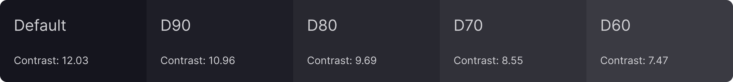
The foundations of dark mode
I decided to settle on Material's guidelines for dark mode due to its vast use in the industry and straightforward implementation guidelines that focus on accessibility and aesthetics. It uses color and shadows to define elevation and levels since shadows alone aren't visible to elevate components on dark backgrounds.
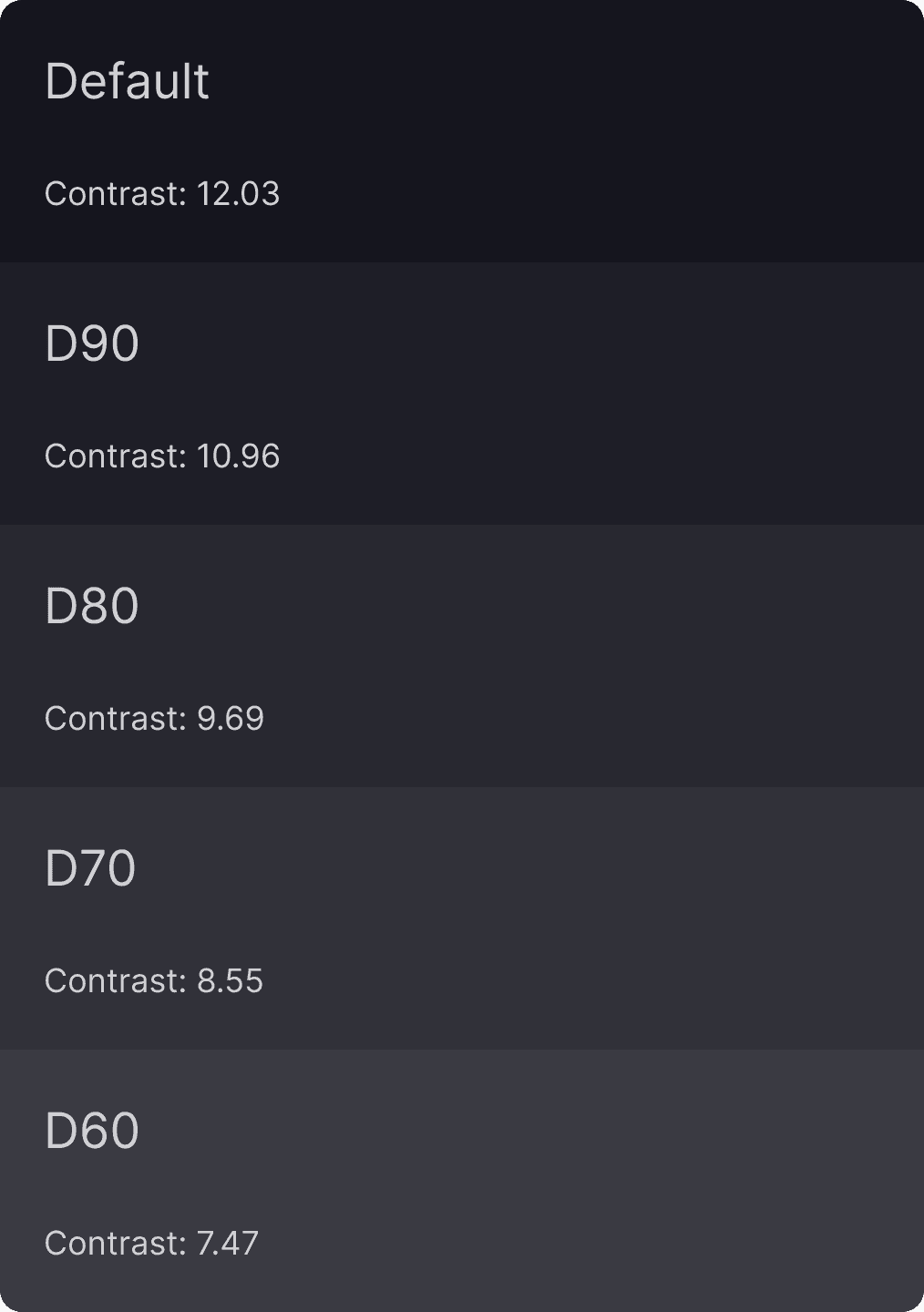
I created a 5-color dark grey ramp to accommodate backgrounds. I used the existing grey palette for foregrounds and the text hierarchy. WCAG implementation was important for long-form reading here. However, I also wanted to ensure the text wasn't too bright for readers. It took 2-3 iterations post-launch with consistent feedback from our users to get the text color just right.
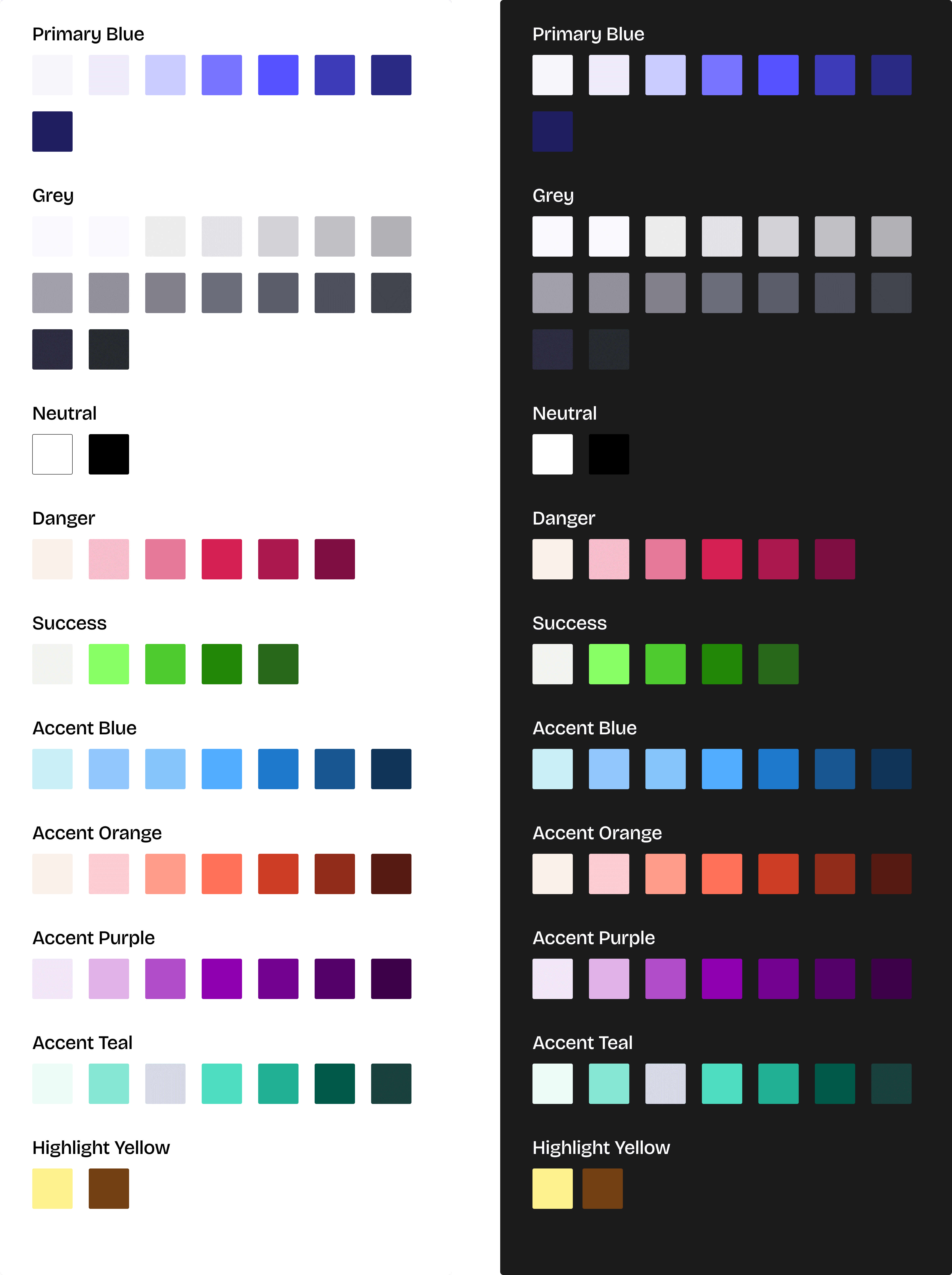
Component updates
Changes to the component library
I added dark mode variants for each component and tested them rigorously against each of the five backgrounds, subsequently adding them to the design system for everyone to use. I also fixed our existing Danger color palette by adding a missing tint of red to keep it consistent with other colors and make it compatible with the dark mode.
The Conversion Guide
Documentation for Developers
Due to the scale of the product, I prioritized main pages of our product to be redesigned in dark mode. For the rest of the pages, I created a conversion guide for developers, using code as examples. A preview can be seen here:

Future Work
More problems to fix
Adding the dark mode left some incompatibilities with our existing colors in our design system. As I continued my focus on other high impact projects, this project went into the backlog, however, I continued my research. At the time of writing this case study, I am collaborating with another teammate on revamping our color system for the dark and light mode.